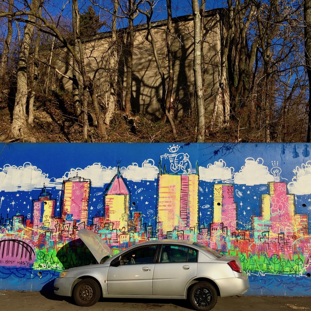
Real skyline above, fantasy skyline below. Dirty Franky’s Laundromat, Beltzhoover. [mural by Baron Batch]
No, four years on and five posts into the series, it feels like we’re just getting started cataloging every time we see clustered renderings of PPG Place, US Steel tower, the Highmark needle, bridges on either side, etc. That first story, from January, 2016, had a mere five examples in it. Looking back, our editors hang their heads low at this naively pathetic early offering–nowadays, we can bag that many skylines in a good weekend!
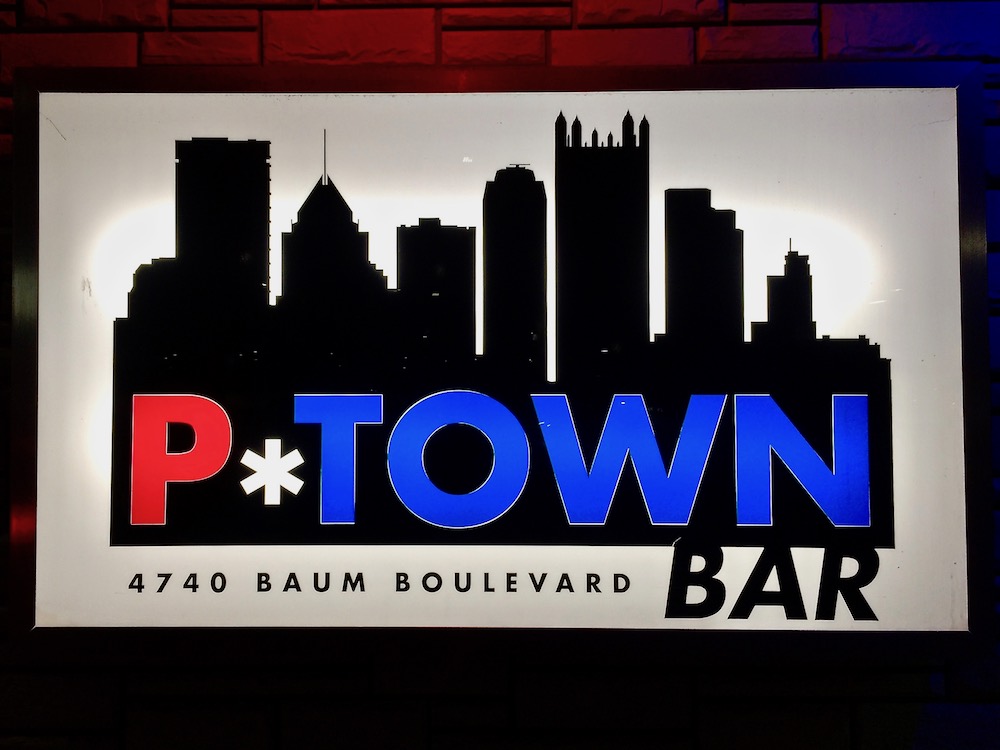
Silhouette city. P*Town Bar, North Oakland.
We must have walked/driven past the provocatively-named P*Town Bar on Baum Blvd. a zillion times, but have you ever really looked at the backlit, multicolor sign out front? It’s a perfect silhouette of downtown Pittsburgh’s tallest buildings forming an artful lineup against a pure white background. While it’s questionable that you’d get a vantage point to see these tall buildings in this exact arrangement, P*Town clearly gets an A+ for showing off city skyscrapers in all their glory.
It’s not alone. From Tow-tegrity’s giant hauling hook about to decapitate PPG Tower to the ambitious cyclist scaling the roof of Gateway Center for Bike the Burgh Tours, this batch of Pittsburgh city-scapes is almost entirely commercial in nature. Hey–it still took a (graphic) artist to put them together.
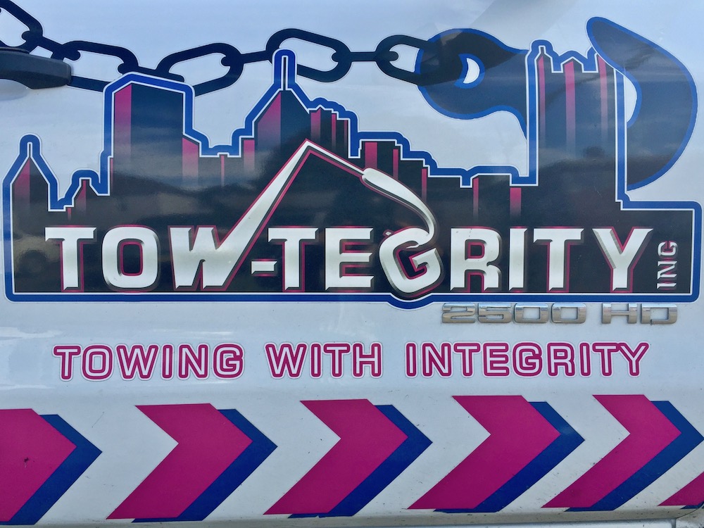
Hooked on the skyline. Tow-Tegrity, Inc. “Towing with Integrity,” New Brighton.
If you’re going to include skyline imagery and call your business or organization Pittsburgh this or Steel City that or River City the other, you might as well go all-in with a patriotic color scheme.
This time around, there are plenty of signs rendered in Pittsburgh no-brainer black-and-gold.
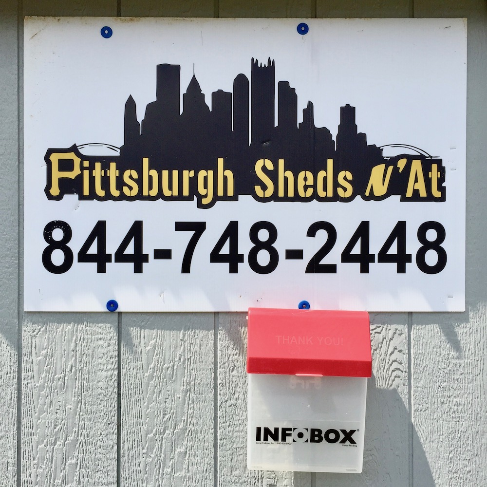
Skylines N’At. Pittsburgh Sheds N’At, Gibsonia
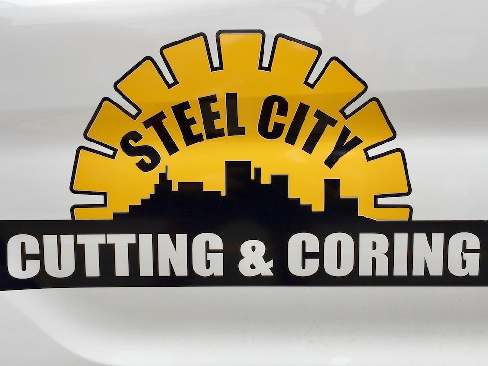
Pixelated Picksburgh[1]. Steel City Cutting & Coring.
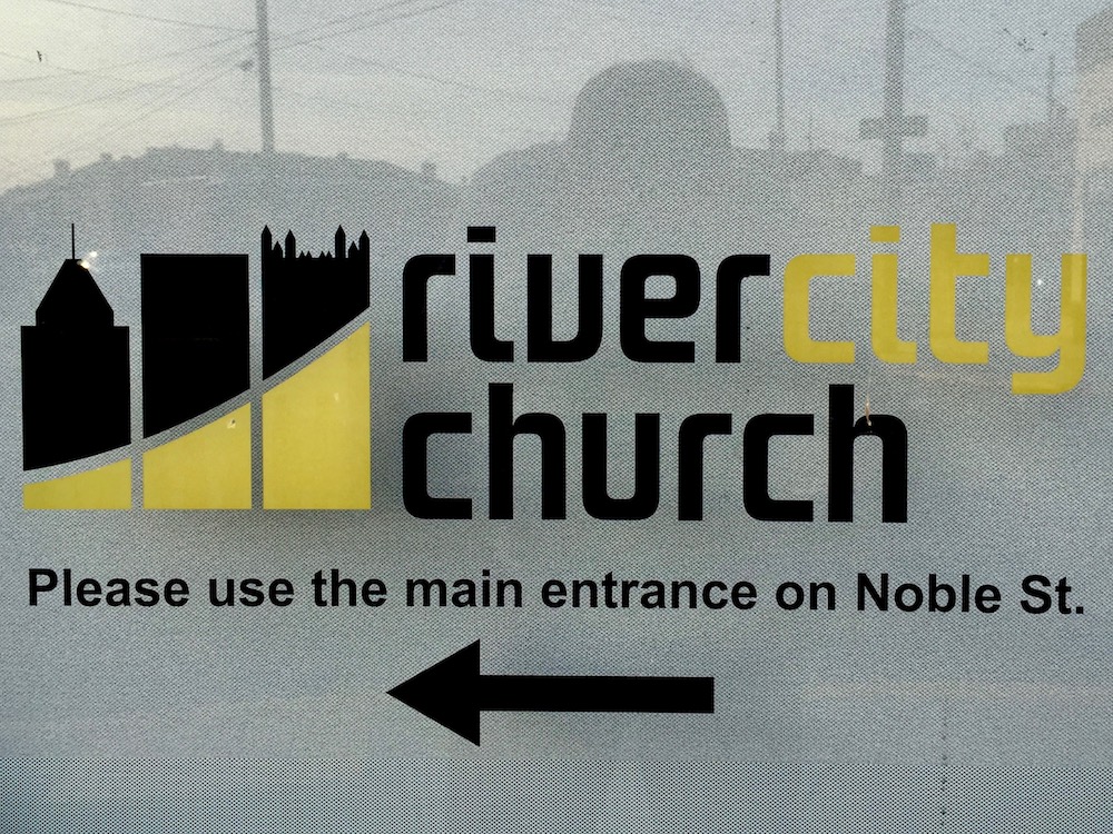
Skyline reduced to three buildings. River City Church, Swissvale.
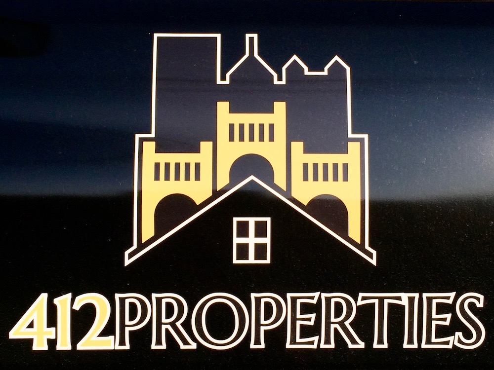
412 Properties, Lawrenceville
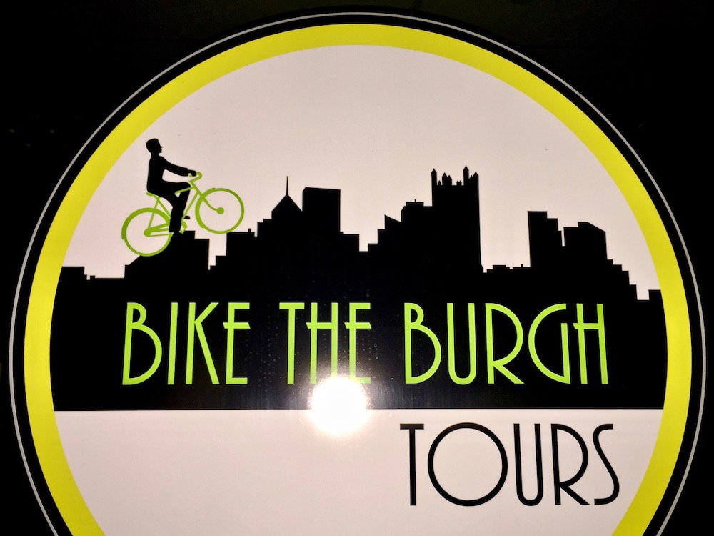
If you thought the complaining about bicycle lanes was bad now, check out this new plan. Bike the Burgh Tours, downtown.
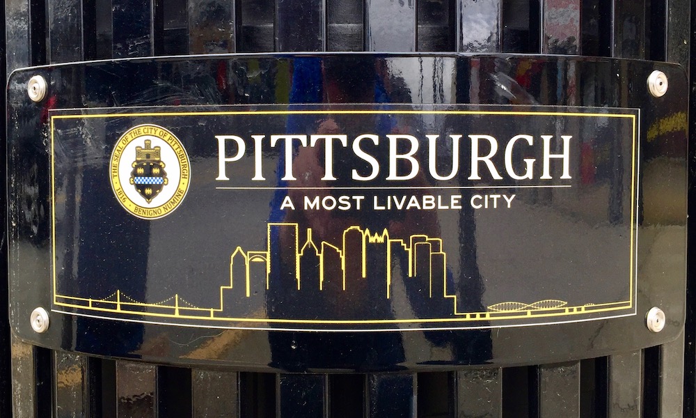
A most livable skyline. City waste bin plaque.
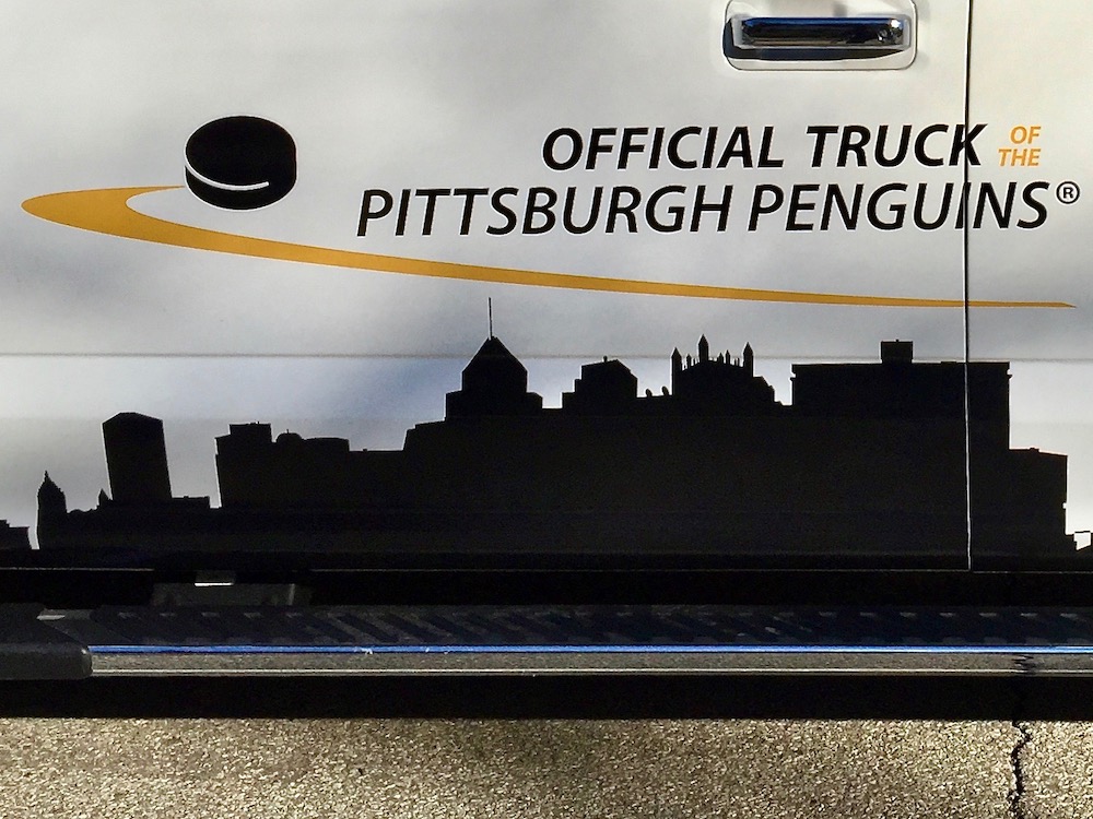
Pucks over Pittsburgh! Ford, the Official Truck of the Pittsburgh Penguins.
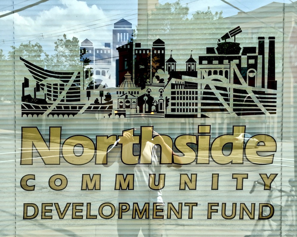
Skyline looking south. Northside Community Development Fund, Deutschtown.
Of course, not every establishment felt the need to go with the de rigueur color scheme. Pittsburgh skyline logos also come in green and white; red, white, and blue; teal and violet; and green and blue.
No judgement here. These businesses are staking their claim as hometown products of Pittsburgh and should be rewarded for their effort. Hats–and in the case of The Cricket, lots of other garments–off to all of these places. This fifth time around, they all get a high five for the skyline.
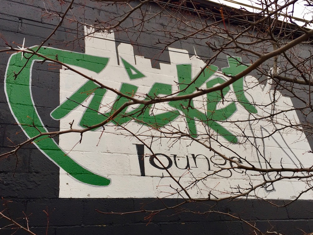
Even naked ladies like the Pittsburgh skyline. Cricket Lounge, North Oakland.
Sci-Fi Sky. Skyline meets triangle + boomerang modern astral ring. Pittsburgh Community Services, Inc., Oakland.
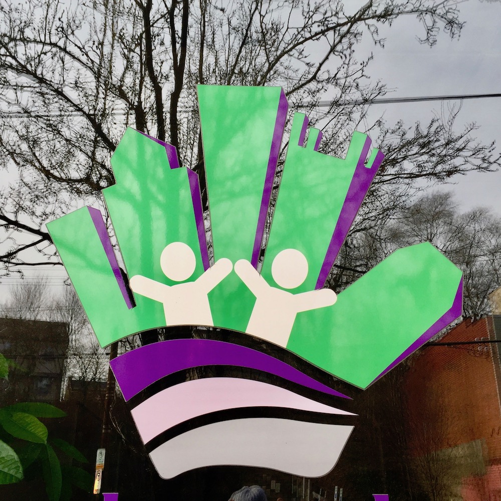
Skyline as helping hand. Pittsburgh Cares, Lawrenceville.
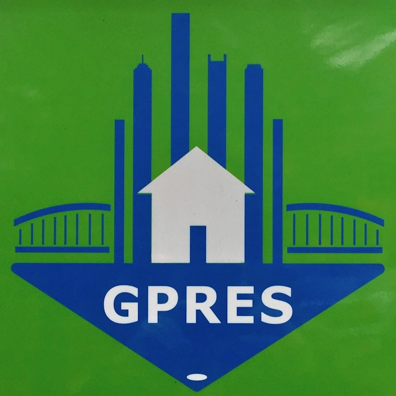
Skyline as bar chart. Greater Pittsburgh Real Estate Services.
Skyline as public art. Irwin.
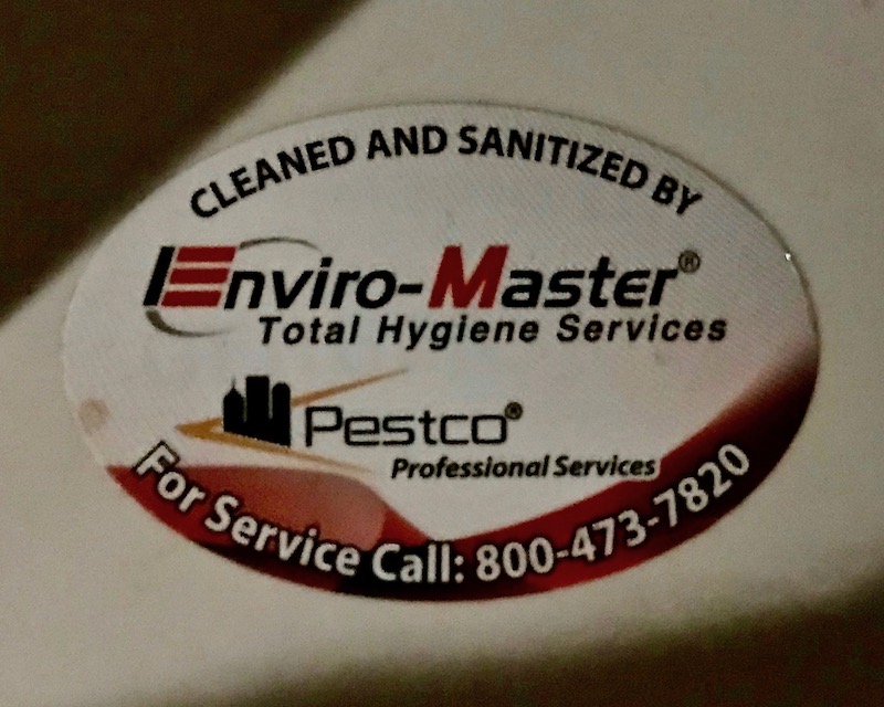
Hygiene City. Enviro-Master Total Hygiene Systems[2]. [photo: Lee Floyd]
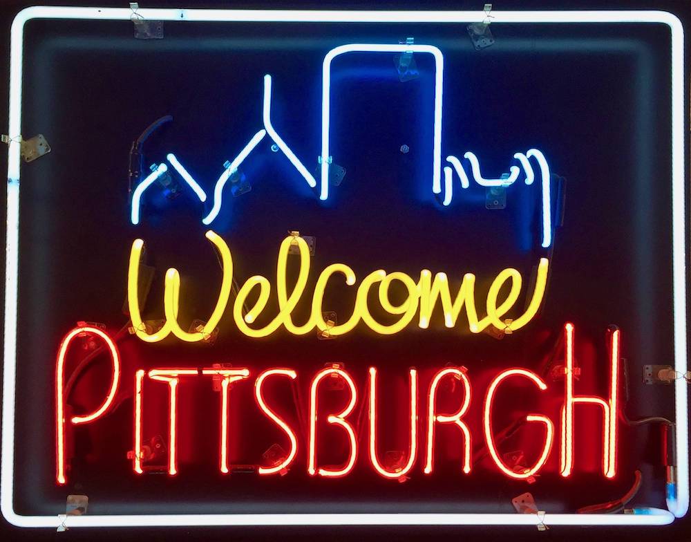
Neon skyline. Welcome Pittsburgh, downtown.
[1] While Steel City Cutting & Coring wears their hometown bona fides right in the company name and color scheme, this heavily-abstracted graphic may be a true Pittsburgh skyline, but it could also just be some generic city-like thing. We have to include it, though.
[2] Enviro-Master is a national company, based in Charlotte, NC. It’s unclear whether the small logo, featuring three buildings and an angled gesture, are part of the corporate identity or local branding. [I couldn’t locate the same image–or any company logo–on their web site.] Regardless, it looks enough like a nod to downtown Pittsburgh and the Point that we’re counting it.

Naked ladies like the skyline? Is this an informal poll or have you done the research?
LikeLike
OMG, that opening photo. How did it slip by me? It’s cool on many levels. Here’s the Portland Orbit’s response: https://portlandorbit.wordpress.com/2020/01/15/portland-skyline…d-theres-tracing/
LikeLike
Sorry for the frustration. Here’s our updated link. I hope it works. https://portlandorbit.wordpress.com/2020/01/16/portland-skyline-theres-fine-lines-and-theres-tracing/
LikeLike