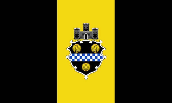
(Current) flag of the City of Pittsburgh. Can we do better?
The flag–any flag–should be a glorious, triumphant emblem that trumpets the twin messages this is who we are and you’re here now. It’s raised high above government buildings and hangs formally inside legal chambers. And–if you get it right–the public takes the flag into their own hands.
With a good flag, loyalists adopt its design as their own–flying it freely from front porches and attaching plastic decals of it to windows and bumpers; they paint it on garage doors and wear it in the form of track suits. Kindergarten teachers will instruct young patriots in the art of creating facsimiles from finger paint and popsicle sticks.

No one makes these for the city flag. Homemade 28-star American flag, Apollo
When we talk about the flag of the City of Pittsburgh, we’re clearly not at this level of either fandom or familiarity. Do you know anyone not named “the mayor” who owns a Pittsburgh city flag? Do you ever see it flown in your neighbors’ yards or waved at public events the way people hoist the rainbow flag, Steelers banner, or the Jolly Roger? If we hadn’t included the image Pittsburgh’s flag [above] would you even be able to describe what it looks like?
My guess is you’ll answer no to each of these questions–and that’s a shame. Pittsburghers love their city and we should have a city flag we’re equally proud of.

Hey: somebody’s flying it! Flags of Italy, USA, and Pittsburgh, Panther Hollow
So what’s wrong with the flag we have? Let’s start with the colors. In Pittsburgh, we accept high-contrast black and gold as natural bedfellows–like french fries and ketchup, or french fries and sandwich meat, or french fries and salad greens. The extra addition, however, of the blue and white detail in the central checkerboard crest is what really sends this palette from reckless driving into fatal collision. Nowhere should these four colors intersect–not even in Cleveland.
While the background black/gold/black vertical sections are a nice, simple, bold presence, they’re directly at odds with the completely useless design-by-committee noise in the middle of the flag. Here, a cartoonish tri-turreted castle–looking like the packaging for a child’s play set–awkwardly either floats above or balances tenuously atop the curlicue formality of the city crest.
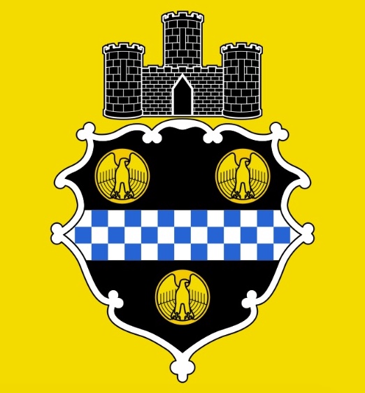
Detail: “A triple-towered castle masoned Argent” and “a fess chequay Argent et Azure, between three bezants bearing eagles rising with wings displayed and inverted”
Putting aside questions about why the City of Pittsburgh is represented by a medieval European-style fortress, its pairing with an embellished coat-of-arms inherited from William Pitt is particularly dissonant. [These are referred to as “a triple-towered castle masoned Argent” and “a fess chequay Argent et Azure, between three bezants bearing eagles rising with wings displayed and inverted,” respectively.]
This combination creates chalk and cheese design elements that not only have nothing to do with each other and are scaled in odd proportion, but look like they were rendered by entirely different hands. Mercifully, there isn’t any text to not be able to read in the crest, but from any distance I dare you to find anyone who can make out those “eagle-fronted bezants” flapping in the breeze.
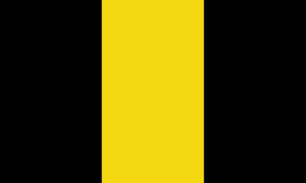
Less is more. The same flag, without the crap.
Pittsburgh Orbit will never advertise itself as a design shop, but even without the background and very limited fake-Photoshop skills, the simple removal of the junk in this flag’s trunk–that being the ridiculous castle and crest–seems like an enormous win. We’d fly that thing off the H.M.S. Orbit with pride. Further streamlined down to the bare minimum square of one each black and gold halves may be even better.

Even less is even more…maybe. Two-tone black/gold square.
Something clearly needs to be done around here. There were grandiose plans: a design contest! with celebrity judges! a big-reveal gala event! we could even pitch it to the city! Meetings were taken with, you know, a media partner and real designers. But…ah, hell–that’s a lot of work and you try finding a local expert in vexillology. Heck, just try pronouncing it!
All that said, the simple goal remains to come up with a banner that Pittsburghers will recognize, identify with, and fly proudly from their eves and stitch to the seats of their pants.
SO, here’s where you, dear reader and creative acquaintances of dear reader, come in. We’d love to see your submissions for a redesigned flag for the City of Pittsburgh. This blogger has no idea whether The Orbit‘s audience would support such an effort, but we’re crossing fingers and, like Casey Kasem, keeping our feet on the ground, and reaching for the stars.
Note: This contest has ended, so we’ve removed the submission details. You can see the results at our follow-up story Vex Ed: Designs for a new Pittsburgh flag (Oct. 8, 2017).
Hey, it’s an option!
Background/further study:
- Wikipedia entry for Flag of the City of Pittsburgh
- The North American Vexillological Association’s “Guiding Principles of Flag Design”
- “Vexillionaire”, 99% Invisible episode on the design history of the Portland city flag.

It can’t hurt. You can always fly you own personal Pittsburgh or Orbit flag. Might I suggest playing around with some stripes?
LikeLike
Very interested to see which one comes out as the winner. Guess I have missed the boat on this contest but you can have this free one on me – it’s really your own design anyway but just mounted in a fair way.
LikeLike
Alan, Great design! We probably should have said “…and we’d *still* love to see more Pittsburgh flag redesign ideas…” because we’re still really interested in this idea. If we end up with a follow-up/round 2, we’ll definitely include this one.
LikeLike