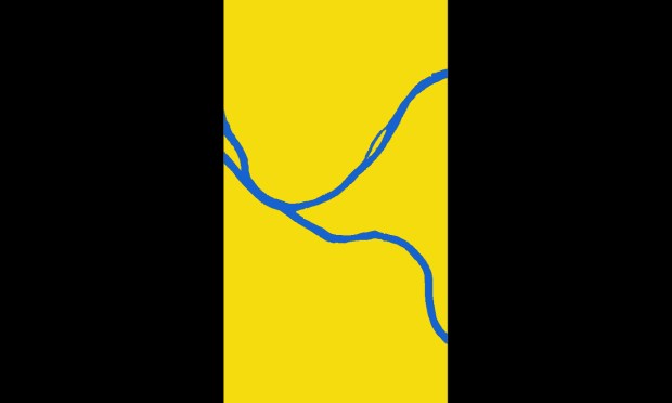
“Three Rivers”, Goob
In a word, rivers. That’s what people–at least, the people who took up The Orbit‘s flag redesign challenge–thought most represented the City of Pittsburgh. Map-perfect renderings of the Mon, the Allegheny, and the Ohio are colored a fantasy blue we’ll never actually see in the murky waters around here. Rivers represented by the most simple wavy-lined icon-style rippling wave forms got there too.
Last month, we introduced a contest to see if readers could come up with a new Pittsburgh flag that would avoid some of the design woes and visual no-nos in our current banner while having a bit of fun thinking about what other options might be on the table. The deadline has passed, those submissions are in, and we’ve got the results for you–right here and right now.
All the flag designs we received are good, but we really love Goob’s[1] “Three Rivers” (above)–a perfect abstracted layout of Pittsburgh’s waterways in broad gold strokes on a solid black field. It’s not city hall official, but the design is so simple and powerful that we could totally imagine this as a sort-of alternate “people’s flag” sold in street stalls in the Strip next to Cleveland Still Sucks and Heath Miller Time: The Champagne of Tight Ends t-shirts.[2] At least, we’d happily fly a version of this from the front porch of Chez Orbit.

“Dark Side of the Mon”, Ian Finch
current flag, enhanced by rivers, Erik Schauer

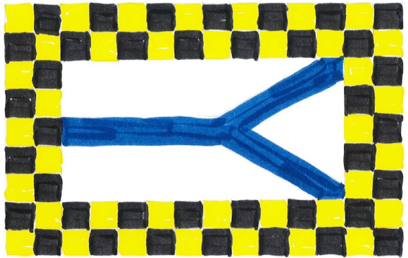
“Argent, a pall wavy issuing from sinister azure, within a bordure checky or and sable”, Ray Strobel
Several of our entrants also mind-melded on the idea of abstracting the general path and arrangement of the rivers as well as the division of the North Side/South Side/East End land masses as angular trapezoidal geometry.
Of these, River Dolfi’s submission is particularly effective as a simple, highly graphic three-color affair with an interesting symbolic narrative. Dolfi explains:
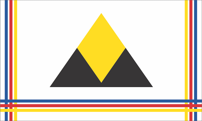
“A flag incorporating the traditional Pittsburgh black and gold. The area of the flag is split into three sections, reflecting the way the three rivers split the real city. These divisions also represent the past/our steelmaking heritage (black), the present golden triangle (the golden triangle), and our blank-canvas future (white).”
Pittsburgh past/present/future, River Dolfi

“Or, between a pall issuant from sinister, three hypocycloids sable”, Ray Strobel

“Argent, a pall issuing from sinister azure, within a bordure checky or and sable”, Ray Strobel
Ian Finch, a graphic designer by day and apparent Pittsburgh ex-patriot, has turned in three cheeky numbers that are all fun. “Dark Side of the Mon” (above) falls into the river category by parodying Pink Floyd’s similarly-titled 1973 stoner/headphone classic. In Finch’s hands, the original album’s prism and light rays cover art becomes a golden triangle separating two bodies of water–one placid; the other gentle rippling waves.
“Mount Worshington” manages to jag on Pittsburgh pronunciation, one of the city’s iconic hilltop neighborhoods, and an old-school patterned tea towel to dry your hands off after all that worshing up.
While Bruce Willis and Sarah Jessica Parker have put 1993’s Striking Distance long in their rearview mirrors, Pittsburghers conjure it every time they “take Bigelow” or lead the police on a high-speed chase that ends up taking out a truckload of Iron City beer barrels. Finch’s tribute is a little harder to parse–and probably not what we as a city want to hang our hat on–but still gets marks for its clever use of the golden triangle blended with police/military stripe imagery.

“Mount Worshington”, Ian Finch
“Striking Distance”, Ian Finch
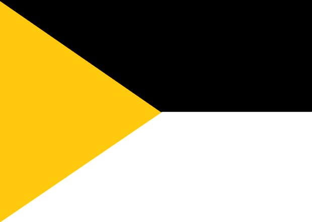
“We all know that Pittsburgh is about many things, but little separates us from other towns like our abundance of bridges and pierogies,” says Paul Schifino about his pierogie-bridge flag. “Is it a bridge? Is it a pierogie? The answer is yes. My goal was to create something graphic with a simple message: We Are Pittsburgh.”
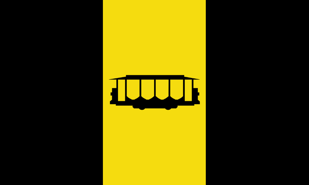
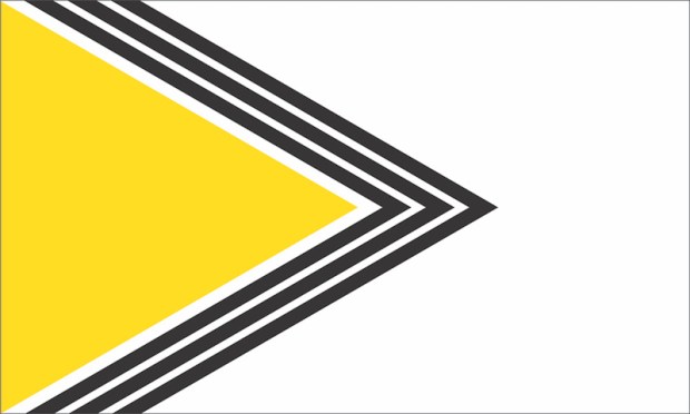
Also in this other category is another entry from Goob–this one taunting us with Pittsburgh’s history of great streetcar lines, mercilessly ripped-out in the 1960s and ’70s to everyone’s continued dismay. Sigh. Oh yeah, maybe it’s also a Mr. Rogers thing.
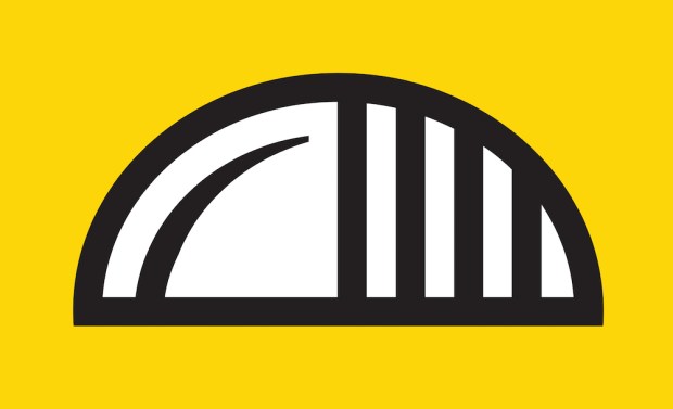
Ray “Ain’t Gonna Happen” Strobel thinks Pittsburgers would rather look at a big-ass insect than the current city flag. But, like Ian Finch, he’s really just riffing on the Pittsburghese n’at / gnat … we think.
“Is it a bridge? Is it a pierogie? The answer is yes.”, Paul Schifino

“Trolley”, Goob

“Or, a gnat proper. (Say it. C’mon… say it. Get it? Get it??)”, Ray Strobel
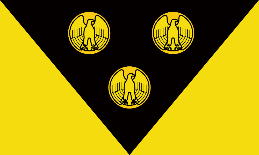
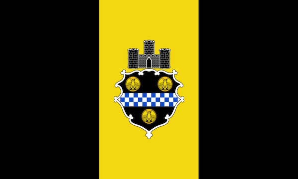
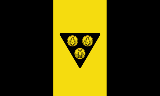
The over-achieving Goob turned in two additional entries, both working from Pittsburgh’s 1925 city ordinance that brought us the current design.[3] “Three bezants bearing eagles rising with wings displayed and inverted Or,” reads the passage which describes this general arrangement of antique golden coins on a black, triangular background.
These two of Goob’s entries are probably the most legit as far as satisfying the original flag definition and something you could actually imagine hanging in the courthouse. That said, we still don’t have either the “fess chequay Argent et Azure” or the “triple-towered castle masoned Argent” that got us into this mess in the first place. So the powers that be would probably throw these entries out on a technicality, but we like them.

“Triangle Coins I”, Goob
“Triangle Coins II”, Goob
One thing about getting into vexillology: you’re going to learn some new vocabulary. We’ve already tripped across bezant (an old Roman/Byzantine coin), sable, argent, and or (the heraldic colors black, white, and gold, respectively).
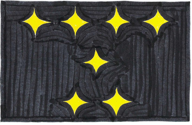
Ray Strobel, who in the high-stakes poker game of Vexillology Stud saw Goob’s four designs and raised that another two, drops this kind of lingua flaga with wild flag-bearing abandon. While it would take a whole glossary to get through descriptions like “Sable, in fess on a hypocycloid or a penguin proper, two leg bones in saltire argent,” the world-wise Orbit reader will get the idea with just a good look at the pictures.

“Sable, in fess on a hypocycloid or a penguin proper, two leg bones in saltire argent”, Ray Strobel

“Sable, seven hypocycloids or, four, one, and two”, Ray Strobel
Finally, Brett Yasko turns in a design that reads like a Zen koan and breaks every rule of flag design. [Brett: don’t you know not to put words on a flag? how’s that thing going to read when it’s 50 feet in the air and there’s no breeze to stretch it out??] That said, what red-blooded cat owner doesn’t like animated gifs?
This one probably stands zero chance of reaching a city council floor vote, but that doesn’t mean we don’t agree with the sentiment. It’s the ones we love that can make us uniquely insane. For anyone–perhaps everyone–who’s grown up in, spent time around, or committed-to Pittsburgh, you’ll probably share some level of understanding how the city drives you crazy because you care about it so much.
The Orbit is doing its thing–and you may well be reading about it–because we love the city that much. Whatever flag you may be flying for the city of Pittsburgh–literally or figuratively–let’s raise it high.

“Sometimes I really hate Pittsburgh because I love it so much”, Brett Yasko
Many thanks to all who participated in the flag redesign challenge–this was really fun. Maybe we’ll do another one along these lines in future.
[1] Presumably not his or her real name, but the anonymity has been preserved at the request of the entrant.
[2] Goob: you and me are going to make so much money! [But we’ll need a real name to make the checks out to.] [Maybe we could do one of things where I drop a manilla folder full of cash into a trash can in the park and you send an innocent rube to pick up the “drop”.] [Ahh, I don’t know if that will really work, but don’t worry–we can figure out the details.]
[3] Flag of Pittsburgh, Coat of Arms and Seal. https://en.wikipedia.org/wiki/Flag_of_Pittsburgh#Coat_of_arms_and_seal