Esplen
A designer knows he has achieved perfection not when there is nothing left to add, but when there is nothing left to take away.*
Antoine de Saint-Exupery
Service & Parts, Manchester
dumpster arrow, Shadyside
Oh, how much simpler life would be if we all just had a little more clear direction. Go that way. Do this thing. It’ll all be O.K.
The arrow is likely the boldest, simplest, and most direct (in a couple different definitions of the word) of visual statements; it is this magic voice from above. Where to go, what choices exist, how to find our way in the world. Without the arrow, we’d all be lost…literally.
Have you seen the back? 223, Homestead
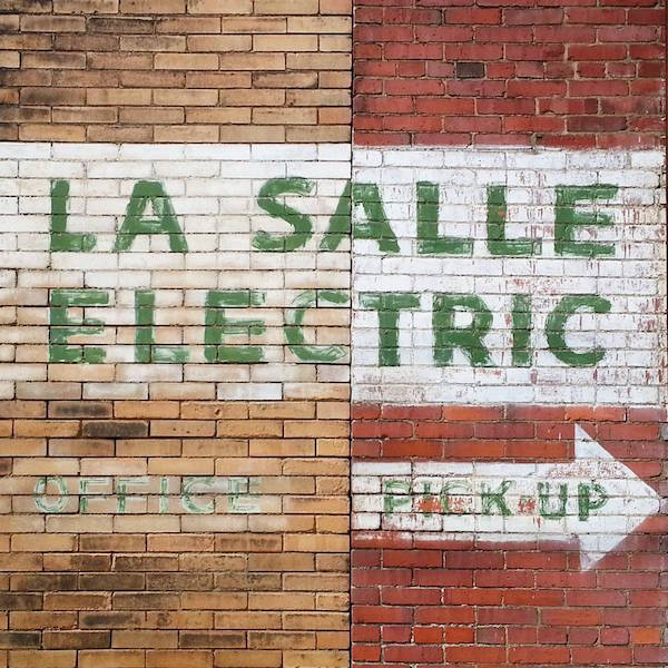
Office this way / Pick-up that way. Former La Salle Electric building (now demolished), Manchester
Constructed with your choice of just three simple lines or as the beefier triangle + rectangle, the form is geometry at its most basic, graphic design boiled down to the last essential elements, universal in both meaning and comprehension. Go that way.
It’s also visually arresting. For such a simple shape, the arrow represents both incredible movement and a certain level of violence. It’s based on–and named after–the form of a projectile weapon, after all. Conflict is inevitable when the point of the spear impacts its target. The inherent tension in this implied collision charges every depiction of the mighty arrow.
airplane arrow, Boeing 737
East Liberty
In a news week dominated by talk around the president’s embrace of Nazis, the alt-right, and his no-teleprompter invention of an “alt-left”, we thought it’d be as good a time as any to seek a little clear direction. [For the record, The Orbit has always considered itself alt-down-and-out.]
Here then, are some fine area examples of that most noble of graphic forms: the arrow. May you all get where you’re going.
Down and out in McKeesport
Brewery Entrance, Lawrenceville
arrow house, West End

Penn Bowling Lanes, Downtown
Manchester
multiple arrow ghost sign: Home Improvement Needs, “The Contractor’s Department Store”, Hill District
store entrance arrow, Etna
F&V Fireworks, Enon Valley, PA
* Yes, someone needs to enlighten Mr. de Saint-Exupery that it may be she who is making the design decisions.

As a reformed arrow collector, that collection never made sense, I enjoyed seeing all these arrows.
LikeLike
Why “reformed”?
LikeLike