Riding in a limousine—or perhaps arriving in a limousine—is the height of elegance. At least, that’s the sales pitch. In car- and celebrity-obsessed America, renting a limousine is an affordable splurge for people on their special day. Put down a couple hundred bucks (I’m guessing?) and you too can be a Kardashian from Carnegie or a Kennedy from, uh, Kennedy.
With but a single phone call—and valid credit card—a very long automobile will ferry you from the church wedding to the reception at the airport Ramada. What happens in the six to twenty-four passenger seats stays in the back, but I’m sure the entire party can pump up the jams, watch a tiny television, or drink champagne—among other activities—in the faux-leather interior all the way to and fro.

Forty-nine different businesses show up in Google’s listings for Pittsburgh limousine services. Who are the people taking all these fancy trips? Your author is in his mid-fifties and never had the opportunity to ride in a limousine or an occasion that warranted renting one. Despite the sour grapes tone of that statement, he also really feels no need or desire to do so. When I blow money it’ll be at the record store, thank you very much.
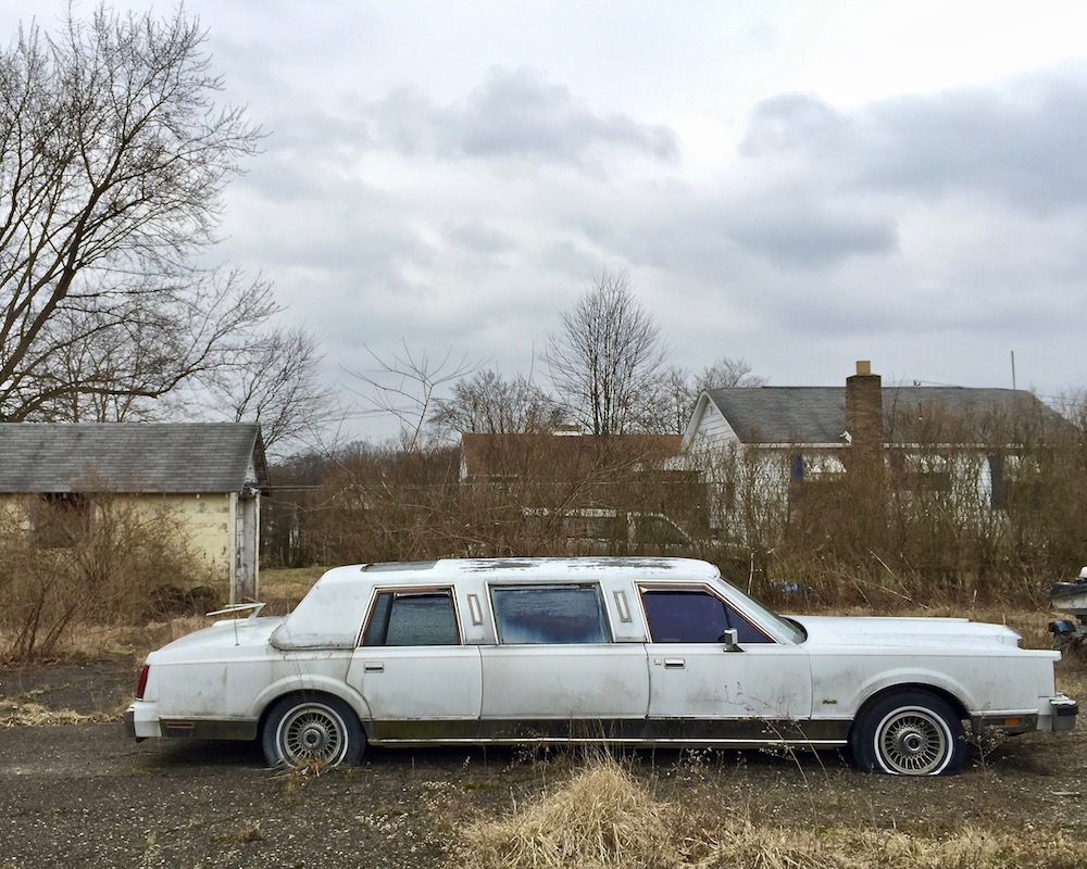
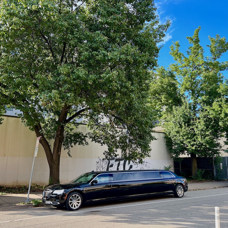
While riding in a limousine may be posh—if only for a brief journey across town—driving one is still very much a working-class job done by real people. All those businesses and independent operators need a place to store the boat-sized vehicles that pay the bills when they’re not idling outside Heinz Chapel or bumping to the club.
These aren’t the kind of cars that fit two-wheels-up-on-the-sidewalk in city neighborhoods or tucked neatly into suburban garages. No, you need some serious real estate to park a 46-foot stretch SUV. People seem to find that room wherever they can—outside industrial buildings and in vacant lots, in alleys and fenced-in compounds.

The Orbit was there to take pictures of them, every time we got the chance. That seems like a fitting theme for this post-New Year’s Eve day when we were at least supposed to have partied like it was 1999 last night.
Whether you were hooping it up in a totally-torqued black Lincoln Town Car or working a jigsaw puzzle with some goofballs from down the block (ahem) let’s cruise into this new year in style … whatever that may mean to you.