Vex Ed: Designs for a New Pittsburgh Flag

proposed Pittsburgh city flag by "Goob" with abstracted design based on Pittsburgh's three rivers

“Three Rivers”, Goob

In a word, rivers. That’s what people–at least, the people who took up The Orbit‘s flag redesign challenge–thought most represented the City of Pittsburgh. Map-perfect renderings of the Mon, the Allegheny, and the Ohio are colored a fantasy blue we’ll never actually see in the murky waters around here. Rivers represented by the most simple wavy-lined icon-style rippling wave forms got there too.

Last month, we introduced a contest to see if readers could come up with a new Pittsburgh flag that would avoid some of the design woes and visual no-nos in our current banner while having a bit of fun thinking about what other options might be on the table. The deadline has passed, those submissions are in, and we’ve got the results for you–right here and right now.

All the flag designs we received are good, but we really love Goob’s[1] “Three Rivers” (above)–a perfect abstracted layout of Pittsburgh’s waterways in broad gold strokes on a solid black field. It’s not city hall official, but the design is so simple and powerful that we could totally imagine this as a sort-of alternate “people’s flag” sold in street stalls in the Strip next to Cleveland Still Sucks and Heath Miller Time: The Champagne of Tight Ends t-shirts.[2] At least, we’d happily fly a version of this from the front porch of Chez Orbit.
proposed Pittsburgh city flag by Ian Finch with gold triangle and black river waves imitating the Pink Floyd "Dark Side of the Moon" album cover

“Dark Side of the Mon”, Ian Finch

proposed Pittsburgh city flag by Erik Schauer with blue river river design on existing black/gold/black tri-color background

current flag, enhanced by rivers, Erik Schauer

design sugestion for new Pittsburgh flag by Ray Strobel with blue wavy river lines

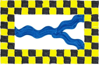
“Argent, a pall wavy issuing from sinister azure, within a bordure checky or and sable”, Ray Strobel

Several of our entrants also mind-melded on the idea of abstracting the general path and arrangement of the rivers as well as the division of the North Side/South Side/East End land masses as angular trapezoidal geometry.

Of these, River Dolfi’s submission is particularly effective as a simple, highly graphic three-color affair with an interesting symbolic narrative. Dolfi explains:

“A flag incorporating the traditional Pittsburgh black and gold. The area of the flag is split into three sections, reflecting the way the three rivers split the real city. These divisions also represent the past/our steelmaking heritage (black), the present golden triangle (the golden triangle), and our blank-canvas future (white).”

proposed Pittsburgh city flag by River Dolfi featuring gold triangle with black and white other sections

Pittsburgh past/present/future, River Dolfi

design sugestion for new Pittsburgh flag by Ray Strobel with black lines to represent the three rivers and three black hypcycloids on a gold field

“Or, between a pall issuant from sinister, three hypocycloids sable”, Ray Strobel

design sugestion for new Pittsburgh flag by Ray Strobel with blue lines representing the rivers

“Argent, a pall issuing from sinister azure, within a bordure checky or and sable”, Ray Strobel

Ian Finch, a graphic designer by day and apparent Pittsburgh ex-patriot, has turned in three cheeky numbers that are all fun. “Dark Side of the Mon” (above) falls into the river category by parodying Pink Floyd’s similarly-titled 1973 stoner/headphone classic. In Finch’s hands, the original album’s prism and light rays cover art becomes a golden triangle separating two bodies of water–one placid; the other gentle rippling waves.

“Mount Worshington” manages to jag on Pittsburgh pronunciation, one of the city’s iconic hilltop neighborhoods, and an old-school patterned tea towel to dry your hands off after all that worshing up.

While Bruce Willis and Sarah Jessica Parker have put 1993’s Striking Distance long in their rearview mirrors, Pittsburghers conjure it every time they “take Bigelow” or lead the police on a high-speed chase that ends up taking out a truckload of Iron City beer barrels. Finch’s tribute is a little harder to parse–and probably not what we as a city want to hang our hat on–but still gets marks for its clever use of the golden triangle blended with police/military stripe imagery.

proposed Pittsburgh city flag by Ian Finch with black and gold triangle mountain and cloth-woven border in blue, red, and gold

“Mount Worshington”, Ian Finch

proposed Pittsburgh city flag by Ian Finch of military-looking gold triangle and angled black stripes

“Striking Distance”, Ian Finch

“We all know that Pittsburgh is about many things, but little separates us from other towns like our abundance of bridges and pierogies,” says Paul Schifino about his pierogie-bridge flag. “Is it a bridge? Is it a pierogie? The answer is yes. My goal was to create something graphic with a simple message: We Are Pittsburgh.”

Also in this other category is another entry from Goob–this one taunting us with Pittsburgh’s history of great streetcar lines, mercilessly ripped-out in the 1960s and ’70s to everyone’s continued dismay. Sigh. Oh yeah, maybe it’s also a Mr. Rogers thing.

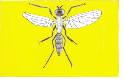
Ray “Ain’t Gonna Happen” Strobel thinks Pittsburgers would rather look at a big-ass insect than the current city flag. But, like Ian Finch, he’s really just riffing on the Pittsburghese n’at / gnat … we think.

proposal for Pittsburgh city flag by Paul Schifino with image of pierogie shape and bridge elements

“Is it a bridge? Is it a pierogie? The answer is yes.”, Paul Schifino

proposed Pittsburgh city flag by "Goob", with silhouetted trolley car against existing black/gold/black tri-colored background

“Trolley”, Goob

design sugestion for new Pittsburgh flag by Ray Strobel with a drawing of a gnat on a gold field

“Or, a gnat proper. (Say it. C’mon… say it. Get it? Get it??)”, Ray Strobel

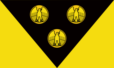
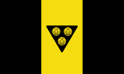
The over-achieving Goob turned in two additional entries, both working from Pittsburgh’s 1925 city ordinance that brought us the current design.[3] “Three bezants bearing eagles rising with wings displayed and inverted Or,” reads the passage which describes this general arrangement of antique golden coins on a black, triangular background.

These two of Goob’s entries are probably the most legit as far as satisfying the original flag definition and something you could actually imagine hanging in the courthouse. That said, we still don’t have either the “fess chequay Argent et Azure” or the “triple-towered castle masoned Argent” that got us into this mess in the first place. So the powers that be would probably throw these entries out on a technicality, but we like them.

proposed Pittsburgh city flag by "Goob", with gold eagle-fronted coins on black triangle on gold field

“Triangle Coins I”, Goob

proposed Pittsburgh city flag by "Goob", with gold eagle-fronted coins on black triangle on existing black/gold/black tri-colored background

“Triangle Coins II”, Goob

One thing about getting into vexillology: you’re going to learn some new vocabulary. We’ve already tripped across bezant (an old Roman/Byzantine coin), sableargent, and or (the heraldic colors black, white, and gold, respectively).

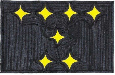
Ray Strobel, who in the high-stakes poker game of Vexillology Stud saw Goob’s four designs and raised that another two, drops this kind of lingua flaga with wild flag-bearing abandon. While it would take a whole glossary to get through descriptions like “Sable, in fess on a hypocycloid or a penguin proper, two leg bones in saltire argent,” the world-wise Orbit reader will get the idea with just a good look at the pictures.

design sugestion for new Pittsburgh flag by Ray Strobel with combined logos of Pittsburgh sports teams

“Sable, in fess on a hypocycloid or a penguin proper, two leg bones in saltire argent”, Ray Strobel

design sugestion for new Pittsburgh flag by Ray Strobel with seven gold hypocycloids in rows of four/one/two on a black field

“Sable, seven hypocycloids or, four, one, and two”, Ray Strobel

Finally, Brett Yasko turns in a design that reads like a Zen koan and breaks every rule of flag design. [Brett: don’t you know not to put words on a flag? how’s that thing going to read when it’s 50 feet in the air and there’s no breeze to stretch it out??] That said, what red-blooded cat owner doesn’t like animated gifs?

This one probably stands zero chance of reaching a city council floor vote, but that doesn’t mean we don’t agree with the sentiment. It’s the ones we love that can make us uniquely insane. For anyone–perhaps everyone–who’s grown up in, spent time around, or committed-to Pittsburgh, you’ll probably share some level of understanding how the city drives you crazy because you care about it so much.

The Orbit is doing its thing–and you may well be reading about it–because we love the city that much. Whatever flag you may be flying for the city of Pittsburgh–literally or figuratively–let’s raise it high.

flag that just includes the text ""Sometimes I really hate Pittsburgh because I love it so much" by Brett Yasko

“Sometimes I really hate Pittsburgh because I love it so much”, Brett Yasko

Many thanks to all who participated in the flag redesign challenge–this was really fun. Maybe we’ll do another one along these lines in future.


[1] Presumably not his or her real name, but the anonymity has been preserved at the request of the entrant.
[2] Goob: you and me are going to make so much money! [But we’ll need a real name to make the checks out to.] [Maybe we could do one of things where I drop a manilla folder full of cash into a trash can in the park and you send an innocent rube to pick up the “drop”.] [Ahh, I don’t know if that will really work, but don’t worry–we can figure out the details.]
[3] Flag of Pittsburgh, Coat of Arms and Seal. https://en.wikipedia.org/wiki/Flag_of_Pittsburgh#Coat_of_arms_and_seal

Weed and See: The “Adjutant” Murals and Riverwalk Cleanup

Adjutant mural, downtown Pittsburgh river walk

They leapt right out, wheels in full motion, from a bicycle seat all the way across the river. There, beneath the on-ramp to the Fort Duquesne Bridge, along the thick concrete barrier walls by Gateway Center, stretches a new(ish) blocks-long mural (or series of murals, whichever way you see it). Even from a significant distance and shaded by the ramp structure above, the painting reads as a great collection of wild flora. It begged for further investigation so we legged it up over the bridge, around the park, and down to the river’s edge.

View of downtown Pittsburgh and the Allegheny River from the North Side with Adjutant murals visible under the Fort Duquesne Bridge ramp

In context: the new river walk murals, under the Fort Duquesne Bridge ramp, from the North Shore

Pittsburgh Orbit has spilled its share of virtual ink looking backwards. We’ve devoted an entire series of “Orbit obits” to things that aren’t there any more and when you fetishize ghost houses and ghost signs and graffiti as much as we do, well, you’re not really thinking about your future.

So we thought we’d start 2016 off right with a fresh-faced forward-looking story on something new to us and nearly brand new to Pittsburgh: this terrific blocks-long series of murals decorating the Allegheny side of the downtown riverwalk.

Adjutant mural detail, downtown Pittsburgh river walk

The murals are actually half a year old at this point, making this blogger wonder where the hell was I? Though he’s bragging about eagle-eying the paintings on this ride, he had to have been down this stretch of riverbank dozens of times without ever seeing them, nor did we catch any coverage in the local news last summer. So let this post be another reminder to get out there and keep the peepers scanning!

Though entirely uncredited at the site (as far as I could tell), The Orbit can Google with the best of them. The giant piece is the vision of artist Kim Beck and titled Adjutant (a fancy word pulled from a Henry David Thoreau quote). A team of some 150 volunteers organized by Riverlife Pittsburgh executed the work during the Three Rivers Arts Festival last June. Two blog posts on the Riverlife site give all the pertinent background and details [see links below].

Adjutant mural, downtown Pittsburgh river walk

If you ever used this section of the riverwalk–the stretch that runs between the northeast corner of Point State Park and the slender Allegheny Riverfront Park that picks up around the Clemente (née Sixth Street) Bridge–you don’t likely remember it for its charms. The passageway was perfectly utile and never felt dangerous (at least in daylight), but walking or bicycling through always seemed like traveling where one wasn’t supposed to–fairly lawless and designed to dock giant barges, not facilitate pedestrian traffic. Corners under the bridge often contained the sleeping bags, tarps, and cardboard boxes of the population that lived down there. Discarded liquor bottles, beer cans, and snack wrappers pointed to late night boozers and early morning fishermen who hung out under its private, protected shelter.

So the project to create the 850-foot (approximately three to four city blocks) mural is both a very welcome beautification of an extremely cold, hard, and dark urban space and also seems to be a wholesale cleanup effort to make the passageway a truly inviting link between the parks on either end.

Adjutant mural of Canada thistle under Fort Duquesne Bridge ramp, Pittsburgh, PA

Not only was this stretch scrubbed for the mural’s creation during the arts festival, but it amazingly seems to have stayed that way some six months on. The pedestrian section of the walk is remarkably litter-free and either Pittsburgh’s taggers have decided to leave these walls alone or the city’s graffiti removal crew does spot-on repair work (I’d bank on the former).

That’s all great, but “cleaning up” part of a city is always a loaded term–especially when it involves human beings. As nice and inviting as the new space is, we can’t help but think about those who were displaced (we assume?) in its transition. We’ve noticed homeless camps pushing farther out from town in a way that suggests you have to go that far to not get hassled by the man. We inadvertently ran into one such group in the Christmas Under the Bridge piece a couple weeks back.

Adjutant mural, downtown Pittsburgh river walk

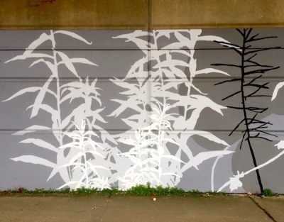
The murals are large-scale depictions of common weeds that appear along Pittsburgh’s riverbanks, rendered in the lean palette of black, white, and a couple shades of gray. Artist Kim Beck informed us that the palette was dictated by the commissioning agency. They look great, but we can’t help but think the addition of some real color would warm the space up considerably and “pop” dramatically against the drab surroundings. That said, we’ll take what we can get, and this is a big improvement on the visual space.

Pittsburgh Orbit’s Pennsylvania wildlife consultant and resident deep woodsman Tim Tomon came down from the trees long enough to identify dandelion, goldenrod, mulberry, pearly everlasting, thistle, wild peppergrass, and wood sorrel among the silhouetted weeds.

Beck’s re-casting of weeds as giant expressions of beauty is certainly an exciting and inviting vision for this just-recently prettified stretch of town. The bright green of the real weeds that peek out from the cracks between foot surface and retaining wall are the only elements of color one sees (save for the bright yellow bridge deck above). Both serve as sweet reminders that a “weed” is purely a situational notion. These all look pretty good to me.

Adjutant mural, downtown Pittsburgh river walk

Sources/more info:

The Over-the-Wall Club: A Secret Picnic Spot

cement wall with graffiti, trees, and smokestacks in the distance

Over-the-Wall lies a secret picnic spot

When last we left The Over-the-Wall Club, members were straining their necks, up on their tip-toes, peeking and peeping. Sometimes we catch a break and actually make it over to have a look on the other side. And every once in a while we find out that the grass really is greener over there.

The most perfect secret picnic spot lies high in the aerie of Peregrine falcons, reachable only by trained tall tree-climbers with provisions shuttled in by drone. Sigh, someday. Until then, Orbit staff stumbled across a right nice substitute, on a grassy bank of the Ohio River, in the shade of flowering Spring trees, attainable only by bicycle. [Technically one could drive, park, and walk a trail, but that’s not as much fun.] The spot is accessed through a breach in a concrete wall.

woman laying on grass by the Ohio River

A very Pittsburgh picnic spot: Brunot Island power plants on the far shore

It is early May, the first definitive shorts-weather occasion of the year, and a glorious post-Pittonkatonk, post-marathon Sunday afternoon comin’ down. Not to nit pick on the picnic, but the menu was nothing to brag about (my fault, entirely). That said, we can credit Shur-Save with providing an acceptable board of fare (after we applied some after-market vegetables and condiments to the “Anytime Deli” sub) at a price that didn’t dent this blogger’s wallet.  Next time–and there will be a next time–we’ll do it up right.

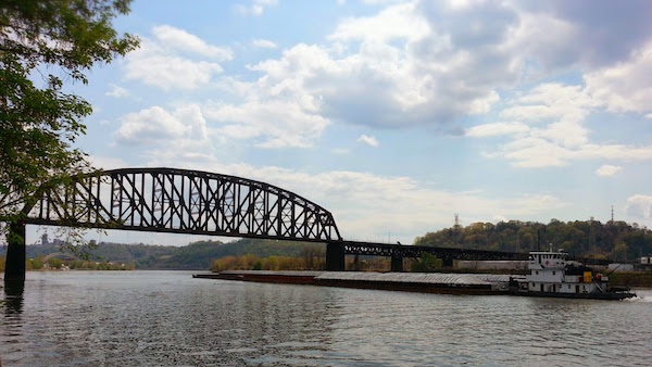
But what’s really special here is the amazing peace on this particular stretch of riverbank. We were well within Pittsburgh city limits, but never heard the sound of an automobile, a booming stereo, shouting, clattering, or any other noise (man or machine) for that matter. In fact, the only “traffic” we witnessed was one long coal barge and a couple pleasure crafts on the river.  One train rumbled by on the Brunot Island bridge.

barge on the Ohio River near Pittsburgh

This barge is all the traffic we encountered at the Secret Picnic Spot

The Secret Picnic Spot is known to at least a few other river dwellers.  There was an empty Black Velvet bottle in the weeds and the burnt offering of an old school hobo fire.  A stray patch of brick wall embedded in the ground had been graffiti’d in black Sharpie.  We crossed paths with a pair of amorous middle-agers and a grandfather/granddaughter combo, but the spot’s fifty-or-so yards of riverbank can handle at least that much of a crowd with relative privacy.

bricks embedded in grass and dirt with handwritten "awsome" graffiti

Don’t take our word for it: Lizz + Neo + Oly confirm that the Secret Picnic Spot is awsome

If you’ve got a tip on a great Pittsburgh picnic spot (secret or otherwise), please let us know. We’ll show you ours if you show us yours.