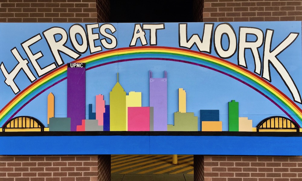
Rainbow city. UPMC Children’s Hospital, Lawrenceville
There are only so many ways a blogger can say, man, does this city we like to include its downtown skyline on stuff or what? But as long as graphic designers are abstractifying and color-blocking the recognizable shapes of US Steel tower, PPG’s spiky glass horns, the Highmark building’s hypodermic needle, etc., we’ll be there to take the pictures and do our best at pithy photo captioning.
In this, The Orbit‘s (gulp) sixth time returning to this seemingly-inexhaustible well, those general building blocks, often bookended with the Fort Pitt and Fort Duquesne bridges, appear in business logos, commercial signage, product packaging, and even one delightful 3-D rendering as tribute for the Heroes at Work essential workers at Children’s Hospital.
Keep well, y’all. To paraphrase the great Casey Kasem, keep your feet on the ground and keep looking at the skyline!

Skyline on skyline. Howlers, Bloomfield
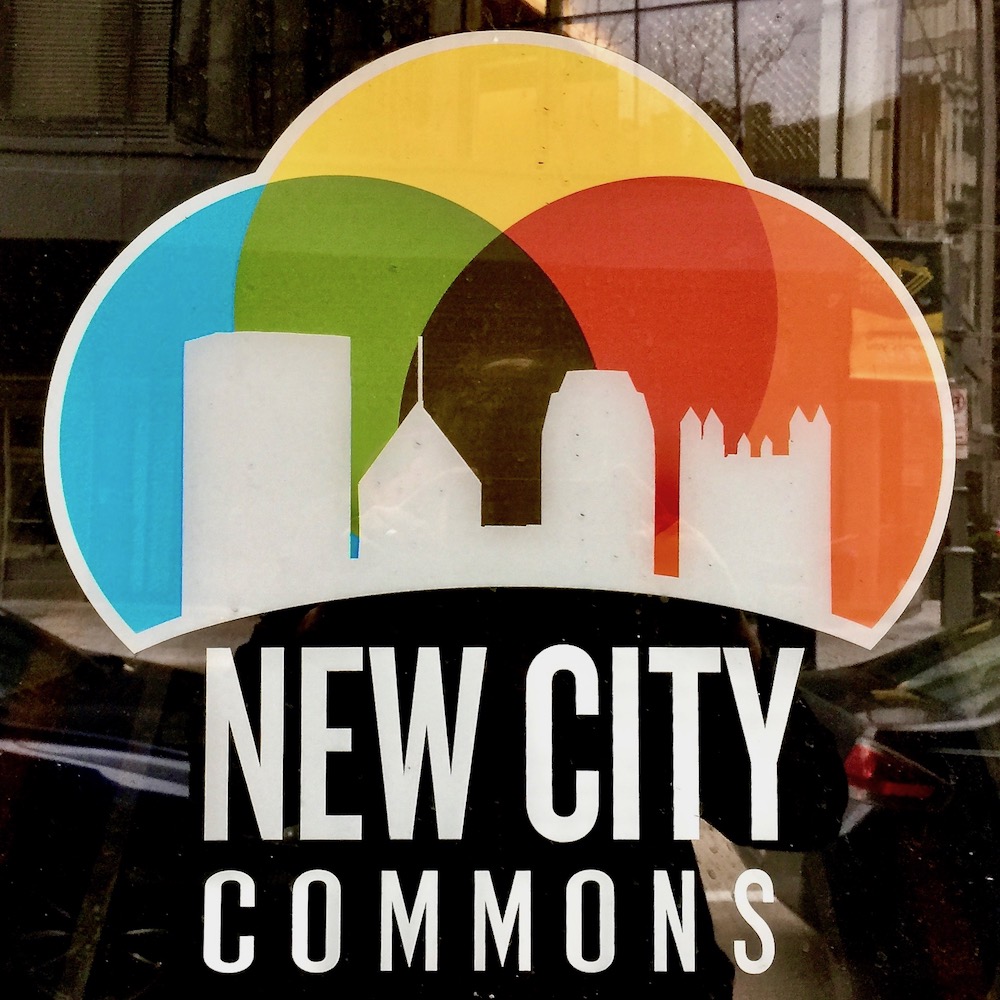
Venn diagram city[1]. New City Commons, Downtown

A city on the move. University of Pittsburgh bus, Oakland

Clean and jerk city. Legends of Pittsburgh gym, Pittsburgh Mills mall
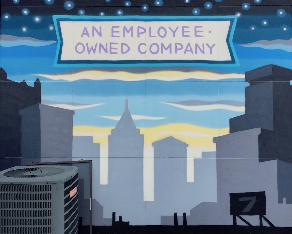
Air conditioner city. Artist & Craftsman Supply, Squirrel Hill
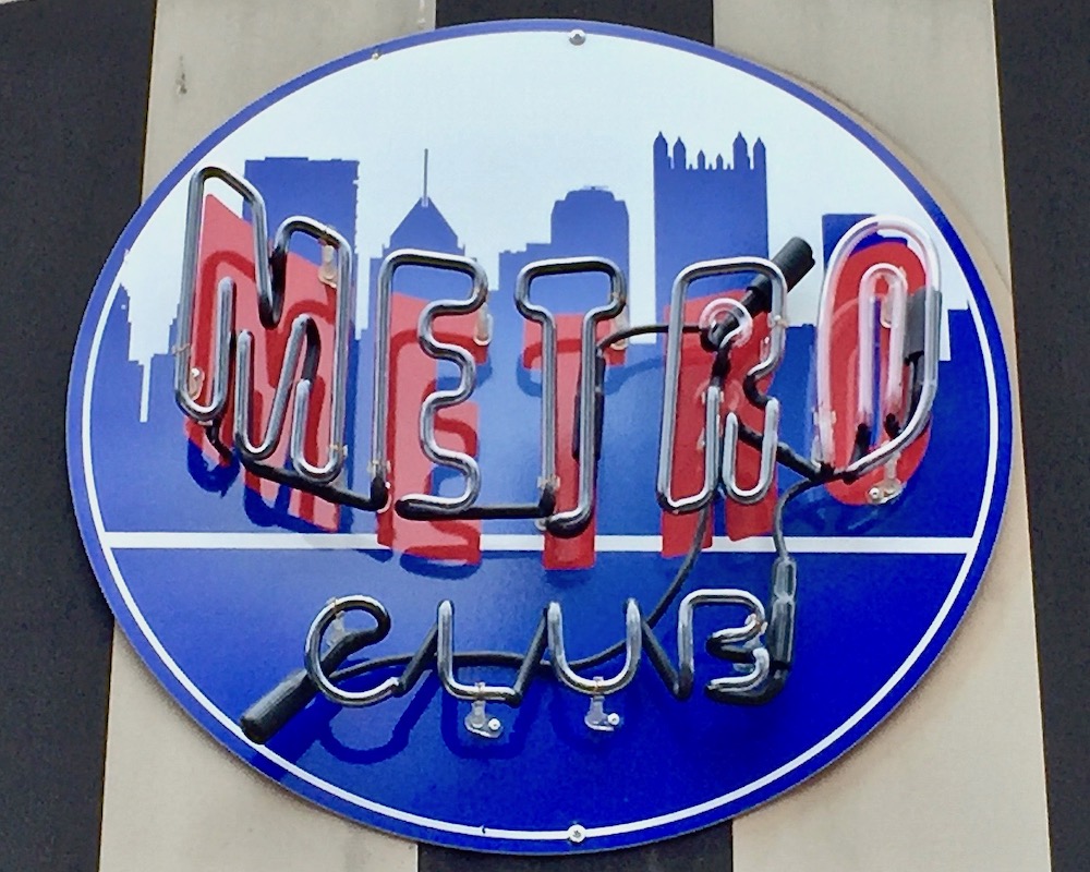
Blue city. Metro Club, Downtown
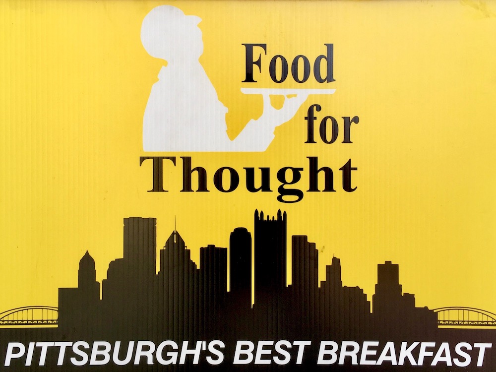
Black and gold city. Food for Thought deli, Oakland

Fart joke city. Pittsburgh Potty
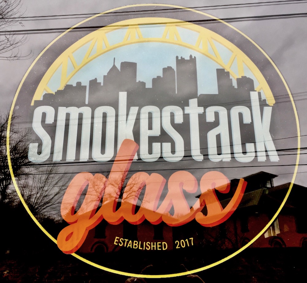
Glass city. Smokestack Glass, Lawrenceville

Smoky/smoking city. Iron Lung, Bloomfield
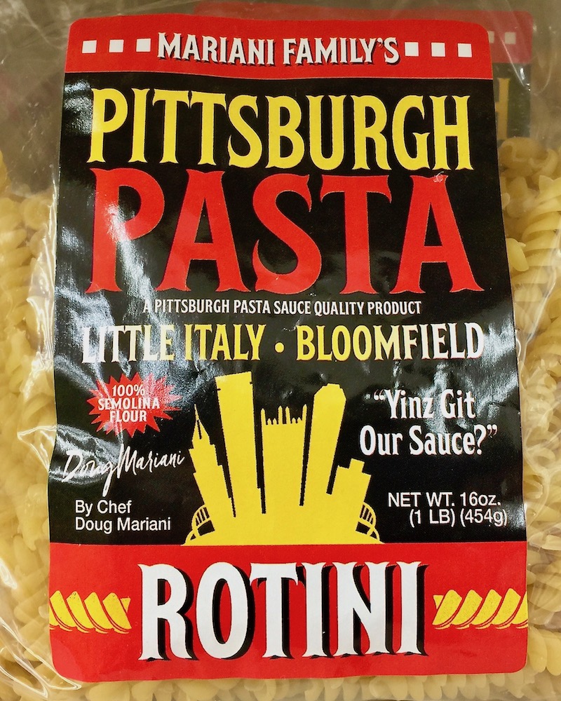
Pasta city. Pittsburgh Pasta, Bloomfield Shur-Save

Double skylines! Greater Pittsburgh Plumbing van[3]

Outline city. Steel City Line-X, Creighton

Vague notion of a city[2]. Civilization PGH, Lawrenceville

A city with a big heart. Steel City Craft Emporium, Strip District
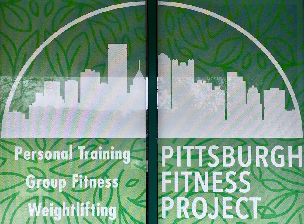
Domed city. Pittsburgh Fitness Project, Lawrenceville
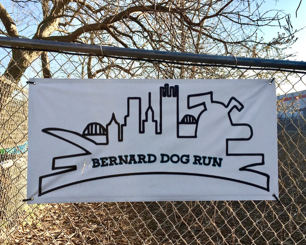
Dogburgh. Bernard Dog Run, Lawrenceville
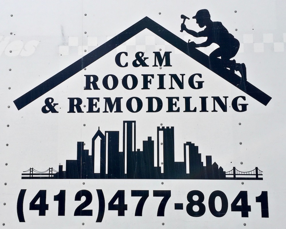
Pittsburgh: the only city with a front door *and* a roof! C&M Roofing & Remodeling
[1] Not sure if this is intentional, but it’s been said that Pittsburgh sits at the Venn diagram between East Coast, Midwest, and Appalachia–and is none of them. If that was the goal with New City Commons’ design, we think it’s pretty clever.
[2] The outline depicted in Civilization PGH’s storefront window may or may not be taken from some neighborhood in Pittsburgh, but it’s certainly not downtown. Though we make it a policy to skip the generic/clip art cityscapes we come across all too often, we chose to include this one because … maybe it’s Pittsburgh?
[3] Orbit superfans will know we included Greater Pittsburgh Plumbing’s black-and-gold city skyline logo in a previous post, but this skyline-on-skyline double image was unique enough to warrant the re-up.
