Downtown Flood Markers

Close-up of a marker for the St. Patrick's Day flood of 1936 on the former Joseph Horne department store, downtown Pittsburgh, PA

Waaaaaaay back (O.K., it was just at the beginning of the year) this only notional blog kicked itself off with a story on one set of cryptic runes reading H.W. 46 ft. 3-18-1936. That (Spoiler alert!) ended up being about the St. Patrick’s Day Flood of 1936 and a couple extant markers we had located in the industrial section of Manchester/Chateau on the North Side.

This blogger wondered aloud (in print) that there must be more where this came from, but that we weren’t actually aware of any. Informed readers responded (thanks Pauline!) to tip us off and we finally followed-up over Labor Day weekend with a cruise downtown to spot a couple more flood markers.

The first of these sits high on a wall (maybe twelve or so feet above street level) at the corner of Penn Ave. and Stanwix Street, on the old Horne’s department store. [The current tenant is the appropriately-named Highmark Insurance company.] It’s a simple brass marker, and like the others, it’s got the date of the flood (actually the day after St. Patrick’s Day, when the water crested) and height (46 ft.).

Marker for the St. Patrick's Day flood of 1936 on the former Joseph Horne department store, downtown Pittsburgh, PA

In context: flood marker on the former Horne’s, Penn & Stanwix, Downtown

We let our fingers do the walking and came up with a tip for one more downtown marker. This one on the Pittsburgh Post-Gazette building on The Boulevard of the Allies. Then, of course, we let our legs do the bicycling, our pores do the sweating (it was really hot that day!), and our fingers do the shutter-clicking to snap this pic.

I realized that I’d never actually walked right up to the Post-Gazette building before, although I’d ridden/driven by plenty of times. I was first impressed by their nice row of thriving potted plants, but then even more so by the big windows that let you look right into the giant rows of printing equipment that fill the first floor. Those huge, old machines are now idle as the paper has recently moved all its printing operations to a brand new facility somewhere outside of town. Sigh. I cursed myself for never stopping to see them all spinning and cranking when they were still in use. That must have been quite a sight. Just like the flood.

Marker for the St. Patrick's Day flood of 1936 on the Pittsburgh Post-Gazette building, Downtown Pittsburgh, PA

Flood marker on the Post-Gazette building, Boulevard of the Allies, Downtown

Any more flood marker tips for The Orbit? Please let us know.

New Kensington Bauhaus: Aluminum City Terrace

Aluminum City Terrace block of two-story units, each with different front yard changes

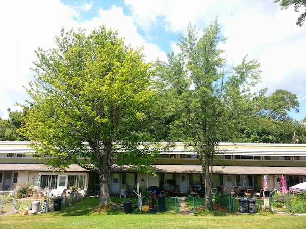
Lived-in: Aluminum City Terrace today

Our story begins with a breakfast dish that goes by the auspicious name Never Again. Two eggs scrambled, bacon, home fries, and “S.O.S.” (Shit On Shingle). This is then topped with cheese and gravy, all in a fabulous pile-up that makes lunch at Primanti’s look like high tea. Needless to say, David’s Diner in Springdale is Orbit-approved.

We’d booked our resident architecture consultants Charles & Susan for a gorgeous bright Sunday morning poke-see at a site just across the river in New Kensington and David’s friendly staff made sure all aboard were well provisioned for the hard journalism work ahead.

The crew was on its way to Aluminum City Terrace, a historically-significant housing complex that touched the interconnected spheres of World War II, big industry, and mid-century rock star architects. We wanted to see what the place looks like today, who lives there, and how it’s fared in the seventy-some years since it was hastily built back in the day.

Original drawings for Aluminum City Terrace, 1942

[image: Library of Congress]

Nineteen forty-two. America had just joined World War II and the nation needed aluminum (along with lots of other raw materials) for the effort. That meant lots of work for New Kensington-based Alcoa and a whole slew of new factory jobs for the town.

In what was reportedly a lightning development process, ex-Bauhaus  founder/instructors/architects and design world big-wigs Walter Gropius and Marcel Breuer drew up a 250-unit campus of cheap, simple, efficient worker apartments specifically geared to Alcoa (and New Kensington’s) immediate need to house the ramped-up workforce. The location was a beautifully hilly section just outside of town. It was a mere two miles as the crow flies from Alcoa’s plants along the Allegheny River, but must have felt like another world compared to the belching industry and urban grid of the New Ken/Arnold flats.

Aluminum City Terrace two-story units

Have you seen the back? The very utilitarian rear of the two-story units

Seeing the apartment buildings in person, the immediate effect is, frankly, underwhelming. Aluminum City Terrace may have a great history and rich architectural pedigree, but the two-story units basically look somewhere between the kind of no-frills “garden” apartments that sit at the perimeter of many American towns and the independent no-tell motels just a little further out. This is especially true of the buildings’ featureless back sides.

The road that snakes through the complex and swells into various parking areas dominates its midsection with a regrettable amount of pavement. There are many opportunities to include a shade tree, flower bed, or line of shrubs, but the groundskeepers of the Terrace have chosen to keep its midway decidedly foliage-free.

It’s not a great first impression–especially because you’re likely only going to arrive here by car, and that will land you on pavement. Look a little deeper, though, and the Terrace tells a really interesting story, both past and present.

I’ll add that Aluminum City Terrace is no Dwell set piece, either. People live here, and the sense of life is apparent everywhere. In the drying beach towels hanging off the back porches, the kids trampoline and sports equipment strewn about the yard, the incongruous white plastic picket fence added to a single unit. Architects must flip a gripper when they see what real people do to “their” spaces, but this neutral observer found the collision to be most enjoyable.

Aluminum City Terrace plan and elevation drawings, 1942

Good on paper: Aluminum City Terrace plan and elevation, 1942 [image: Library of Congress]

The irony of the complex that Alcoa built (not literally–the federal government actually sponsored the project–but you know what I mean) is that there wasn’t a square inch of aluminum in Gropius and Breuer’s design. That is, of course, because America needed all of it to fight the bad guys. What are now the long louvered aluminum sun shades were originally made from wood. The elevations tell us the odd jutting-out second-floor bedrooms/back porch roofs were first clad in vertical cedar siding (since replaced) and back entrances shielded by sleek flat asbestos board canopies (ditto).

Aluminum City Terrace single-story one-bedroom block

One-bedroom units, each with an integrated back porch and shed

Aluminum City Terrace Activities Center

Aluminum City Terrace Activities Center

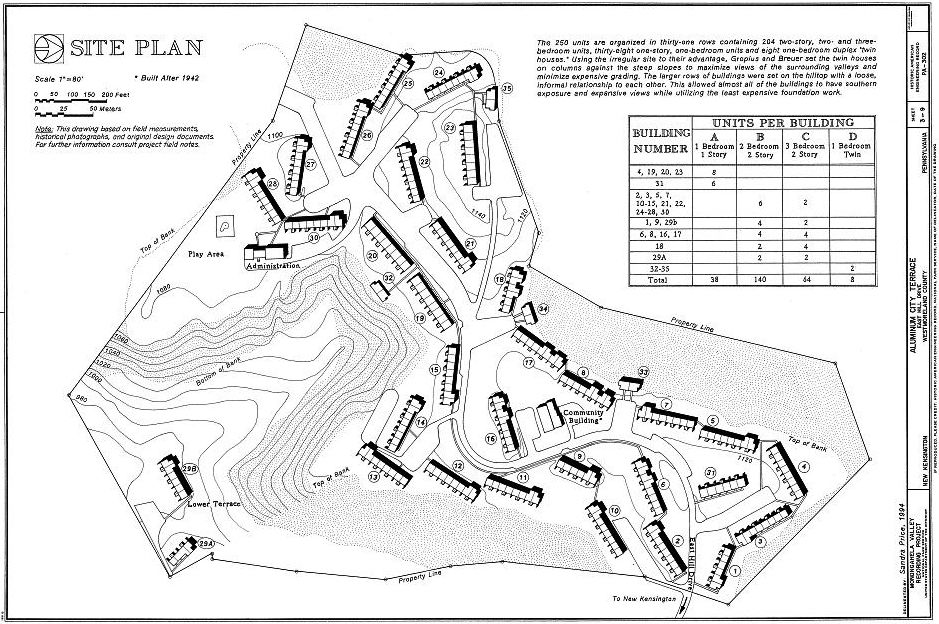
Walking through the complex, I was repeatedly struck by the cattywumpus arrangement of buildings. Each individual set of apartments is one of two designs (single floor one-bedrooms and two-story combined two-/three-bedrooms). The only real exception being the unique yard spaces and controlled additions the current co-op owners have created. But with none of the units lining up in any form of metered placement, it gives the place the overall feeling of a child’s building blocks dropped indiscriminately on a (very well-groomed) lawn, or train cars gently derailed, but untoppled.

I’m sure the primary reason for this was to follow the natural contours of the land. This part of New Kensington is quite hilly, surrounded by trees, and the plan takes advantage of the location in many ways. But even with that in mind, the site plan suggests there was a conscious effort to break evenly lining up any two buildings–either in parallel or perpendicular–on the grounds.

Aluminum City Terrace site plan, 1942

Cattywumpus layout: site plan, 1942 [image: Library of Congress]

We were fortunate to run across a very friendly family, one of whom happened to be on the board of Aluminum City Terrace. They invited the group into their apartment and showed us before and after photos from a large scale remodeling job they’d done. We also got some background on how the co-op system works there.

Residents must apply, pass a background check, and pay a one-time expense to get into the co-op. They then pay monthly upkeep fees for the maintenance of the exteriors of the buildings and grounds. Compared to more strict co-ops (ex: Pittsburgh’s Chatham Village), the residents seem to have a good amount of leniency in the treatment of their yard spaces, adding trees, fences, all manner of shrubs, flowers, vegetable gardens, etc. According to our hosts, all 250 units are occupied and there’s a waiting list to get in.

And it’s easy to see why. The buildings, sidewalks, its one road, and the grounds are in immaculate condition. This is in stark contrast to seen-better-days New Kensington proper. Our hosts told us their daughter is living in a one-bedroom nearby with other relatives also in the complex and there seems to be a strong community throughout. The Terrace is surrounded by trees and was built in maybe the last age before developers routinely flattened the landscape prior to development, leaving it with terrific rolling ups and downs.

Aluminum City Terrace unit with heavily-manicured front yard/garden

There’s a lot going on here: one of the busier/more heavily-maintained front yards

So…what’s the takeaway? Well, this is the first Bauhaus-related project this architecture-curious (but just a casual fan) blogger has experienced up close and personal. As such, it’s cool to find out it’s here, and it’s so loved, lived-in, and accessible in a very real world way. I don’t know much about Gropius and Breuer, but I hope they’d like most of what they’d see seventy years on. I do.

Oh, and that breakfast? On that, David is wrong: you can bet I’ll be having it again.

Lackzoom Acidophilus

Terra cotta facade storefront in Pittsburgh with the engraved names Lackzoom and Acidophilus

5438 Penn Ave: Lackzoom Acidophilus

I must have passed it a thousand times or more.  Certainly I’d noticed the white terra cotta facade and its odd trapezoidal shape, canted in such a way that it doesn’t quite align with the street, like a mis-set bone.

But it wasn’t until very recently that I happened to actually look up and take in the detail above the doorway/windows.  Two names (?) permanently formed into the ceramic tile that read like ancient runes, some hep jazzcat jive, or a preposterous stage name: Lackzoom Acidophilus.

The small, two-story building at 5438 Penn Avenue turns out to have been the one-time laboratory and corporate headquarters for the lineal parent of the General Nutrition Corporation (or GNC), the Pittsburgh-based retail giant that made a fortune over the last half century urging America to “Live Well” vis-a-vis shopping and popping (malls and pills, respectively).

Terra cotta tile reading "Lackzoom"

It’s no surprise that I’m not the only one to ever spot this curious storefront, but there’s remarkably little information out there on it.  The definitive piece seems to be a short Western Pennsylvania History Magazine article written in 2003 by Chris Potter.

Potter’s story details David Shakarian, founder of GNC, whose:

… Armenian parents ran a business called “Lackzoom” which sold yogurt, buttermilk, and Bulgarian acidophilus–milk fortified with the bacteria lactobacillus acidophilus to intestinal bacteria that make digesting milk difficult for some.

Apparently the original Lackzoom never survived The Great Depression, but Shakarian would go on to found his own health food store, and eventually the GNC chain. In 1983, the year before his death, Shakarian was named by Forbes magazine as the wealthiest Pittsburgher on their annual list. Live well, indeed.

Pittsburgh ghost sign reading "Lackzoom and Acidophilus"

Ghost sign, obscured by flora: “Lackzoom and Acidophilus”

Why is purple the color of Lent?

cross with Lenten purple cloth

Why is purple the color of Lent? St. Paul’s Cathedral, Oakland

St. Paul’s Cathedral in Oakland, its giant cross with purple fluttering cloth and large entry door wreaths pops with brilliant purple, especially on the earliest bleak days of the season, when the trees are still bare and the sky is inevitably gray and drizzling.

It looks terrific, but this heathen-turned-blogger decided to seek out a different type of higher power to answer a question that likely all you Catholics already have figured-out: why is purple the color of Lent?  I did the Googling, so you don’t have to.  Here’s what I found out:

Tyrian purple was associated with royalty.  It is also appropriately known as “royal purple.”  The color was largely a status symbol as purple dye was the most painstaking and expensive to produce and therefore purple-dyed fabric was prohibitively expensive for anyone else. From a 2013 New York Times Science article:

To make Tyrian purple, marine snails were collected by the thousands. They were then boiled for days in giant lead vats, producing a terrible odor. The snails, though, aren’t purple to begin with. The craftsmen were harvesting chemical precursors from the snails that, through heat and light, were transformed into the valuable dye. The compounds that turn purple in this process serve a defensive role in the snail — they protect the egg masses from bacterial infection.

Fair enough, but how does this get us to the Bible?  Don’t worry, they’re related.  The explanation is that the regal color is a mockery of the “King of the Jews,” deployed by Pontius Pilate and his soldiers at a crucial spot in that greatest story ever told.  From Mark 15:17-20:

And they clothed him in a purple cloak, and twisting together a crown of thorns, they put it on him. And they began to salute him, “Hail, King of the Jews!” And they were striking his head with a reed and spitting on him and kneeling down in homage to him. And when they had mocked him, they stripped him of the purple cloak and put his own clothes on him. And they led him out to crucify him.

Ouch!  In third grade Mrs. Yuchmow taught us to never start a sentence with “And.”  Small style quibbles aside, I guess we have an explanation.  In perhaps the original example of a group turning an epithet on its head to take back ownership, the Catholic church now recognizes Tyrian purple as the symbolic color of the season.  And they look great doing it.

St. Paul's Cathedral front doors with Lenten purple wreaths

St. Paul’s Cathedral with Lenten purple wreaths

Italian Colors

Two rowhouses in the Bloomfield neighborhood of Pittsburgh: one green, one red

Green house, red house, white snow, Bloomfield

Even the most casual student of the classics will recognize the names of great Italian painters. Botticelli, Caravaggio, Verrocchio–the list goes on and on.  Their descendants made their way in droves to Pittsburgh, settling largely in Larimer, Bloomfield, South Oakland, and other parts of the city.  And they continued to paint.

The medium of choice is still oils (albeit exterior enamel) and they’ve simplified their color palette to the trinity of green, white, and red.  Boldly eschewing the staid canvas and gallery presentation, these artists work large and for the world to see: on cement walls and park benches, street lights and entire houses.

Garage wall in Italian red, green, and white

Garage (detail), Uptown

It’s curious to me that while Pittsburgh’s great expansion in the late nineteenth and early twentieth centuries was famously from eastern and southern European immigrants, it seems that only the Italians felt the need to reproduce the flag over and over again.  Why don’t we see crude renderings of the white eagle on garages in Polish Hill and Lawrenceville?  Why no black, red, and gold telephone poles in Deutschtown?  We’ve got (people who identify as) Croats and Slovaks out the yin yang.  Who’s representing?

Street light pole in Italian colors

Street light pole, Bloomfield

Flower pot with red and white flowers and statue of Jesus

Jesus Planter, Bloomfield

While only a fraction of the population of those other neighborhoods, the tiny neighborhood-within-a-neighborhood of Panther Hollow has possibly more Italian colored things per capita than anywhere else.  There’s a bi-lingual war memorial with the flags of The United States, Italy, and Pittsburgh, an Italian-colored park bench and picnic table, the flag rendered graffiti-style on a retaining wall, and one abbreviated stretch of picket fence.

Park bench and picnic table in Italian colors

Park bench, picnic table, Panther Hollow

It was there, at the very end of Panther Hollow, that we had the great fortune to run into lifetime resident, local historian, and maintainer of the terrific pantherhollow.us website, Carlino Giampolo. “Everyone should have a fence to hide their garbage,” Carlino told us as explanation for the curious freestanding set of tri-colored fence at the edge of his property, the last plot in the Hollow as the dead-end Boundary Street trickles into Schenley Park bicycle trail.

Retaining wall with Italian flag

Retaining wall, Panther Hollow

Carlino went on to tell us about growing up in Panther Hollow, when what is now Pitt’s lower parking lot was a ball field, community park, and cow pasture.  When there were as many as six different operating businesses in the Hollow (today there are none, nor any obvious former retail spaces).  He showed us where the hotel once stood in what is now his side yard, the community oven that would cook the neighborhood’s bread, and how self-sufficient the whole place once was (and not that long ago)–butchering their own animals, making cheese and butter from the small herd of cows they kept, etc.

Picket fence in Italian colors

“Everyone should have a fence to hide their garbage”, Carlino’s fence, Panther Hollow

H.W. 46 ft. 3-18-1936

St. Patrick's Day Flood marker, Manchester

This intriguing painted marker lives on the corner of a big brick warehouse building at Island and Preble Aves. in Manchester.  I came across it bicycle-riding through the neighborhood last summer.  It read like some weird code: H.W. 46 ft.  It wasn’t until thinking about it days later that I put the pieces together: a date (March 18, 1936) and a measurement in feet.  This had to be a high water marker for the Great St. Patrick’s Day Flood of 1936.

Floods happen in Pittsburgh somewhat regularly–especially right at the end of winter when all the collected ice upriver starts melting en masse–but the flood of 1936 was The Big One, the most devastating in the city’s history and the one that provoked massive flood control efforts in and around the city.

view of downtown Pittsburgh from Mt. Washington during flood of 1936

View of downtown Pittsburgh during the flood of 1936 from Mt. Washington

I had a heard about the flood a few times, first and most memorably from a much older co-worker at a place I was temping in the late 1990s who had personally experienced it as a child.  He had this vivid memory of looking down on the city from Mt. Washington and seeing giant rolls of newsprint from the Pittsburgh Post printing facility downtown inflated by the water and floating down the river like giant marshmallows.

I’ve come across very few other physical artifacts of the flood (although one would think there are many others), so this was a really neat discovery.  It wasn’t long, though, until I came across this second marker for the flood on a different ride, but also in the same general area of Manchester (exact address unknown).

St. Patrick's Day Flood marker, Manchester

St. Patrick’s Day Flood marker, Manchester